.png)
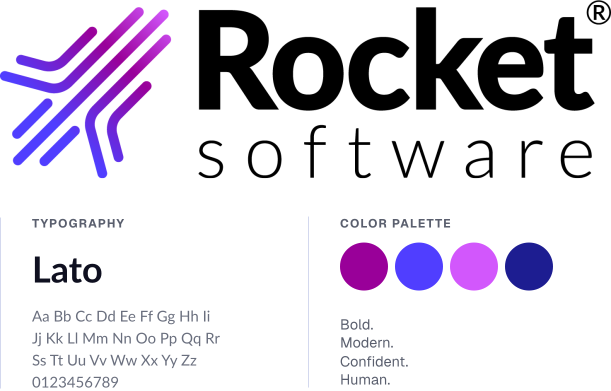
Rocket Software had evolved through acquisitions, modernization and a broader technology portfolio. The business had become something very different from the company its existing identity was built to represent.
But refreshing the brand wasn’t just about looking more modern.
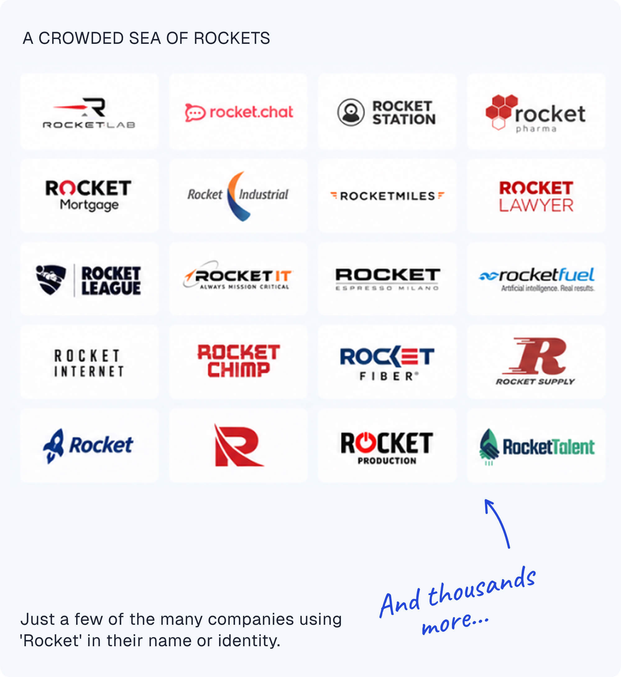
The new identity had to reflect what Rocket Software had become, stand apart from eight direct competitors, and differentiate in a world where more than 8,000 companies were already using 'Rocket' in their name or visual identity.
A logo decision is usually made by the people inside the company — designers, executives and brand teams deciding what feels right.
But the people who ultimately have to notice it, recognize it and attach meaning to it are outside the room.
So we combined art with science: creative judgment to shape the identity, and neuroscience and behavioral testing to understand what was actually happening in the buyer's mind.
We measured what buyers noticed first, what they processed easily and what they instinctively associated with each direction. Across 60+ tests, 25 typefaces and four rounds of iteration, we kept refining based on evidence — not opinion.
.svg)
The logo was only the beginning.
Once the direction was validated, we kept refining the typography, placement, composition and attention flow until every part of the identity worked together.
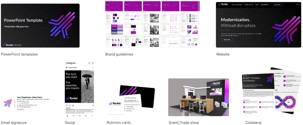
Then we extended that thinking into a complete brand system — brand guidelines, PowerPoint templates, digital banners, letterhead, collateral and the website — so the new identity could show up consistently everywhere Rocket did.
The goal wasn’t simply to create a more modern mark.
It was to build an identity the company could use, scale and make its own.
The new identity didn’t just perform in the research. It landed inside the organization.
The winning direction received 100% stakeholder buy-in when it was first presented, then became the foundation for the broader brand system and global rollout.
As the identity was introduced around the world, the feedback consistently reflected what the new brand was meant to signal:


.svg)

Most teams aren't short of data. They're short of a shared view of what matters — and a way to learn from what they do next.
.svg)